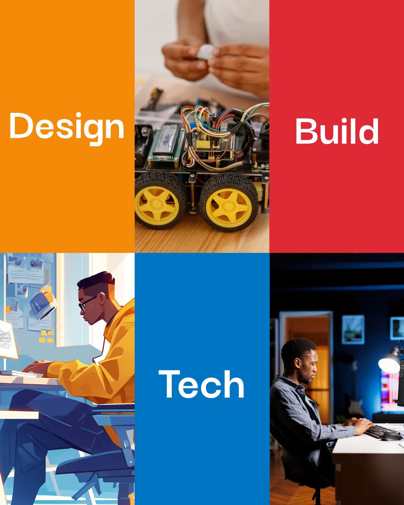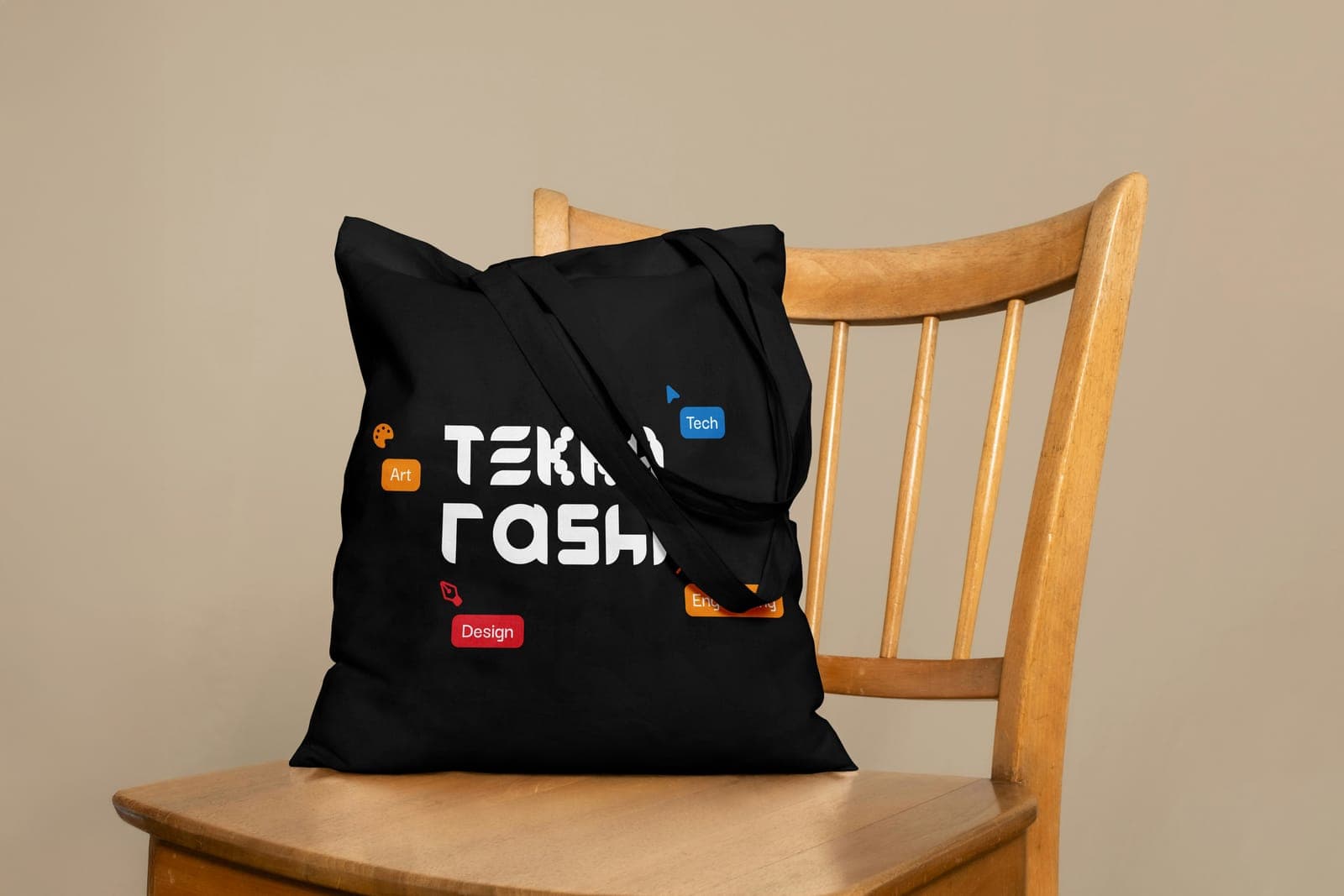
Design — Earlier personal identity
Tekkarashi
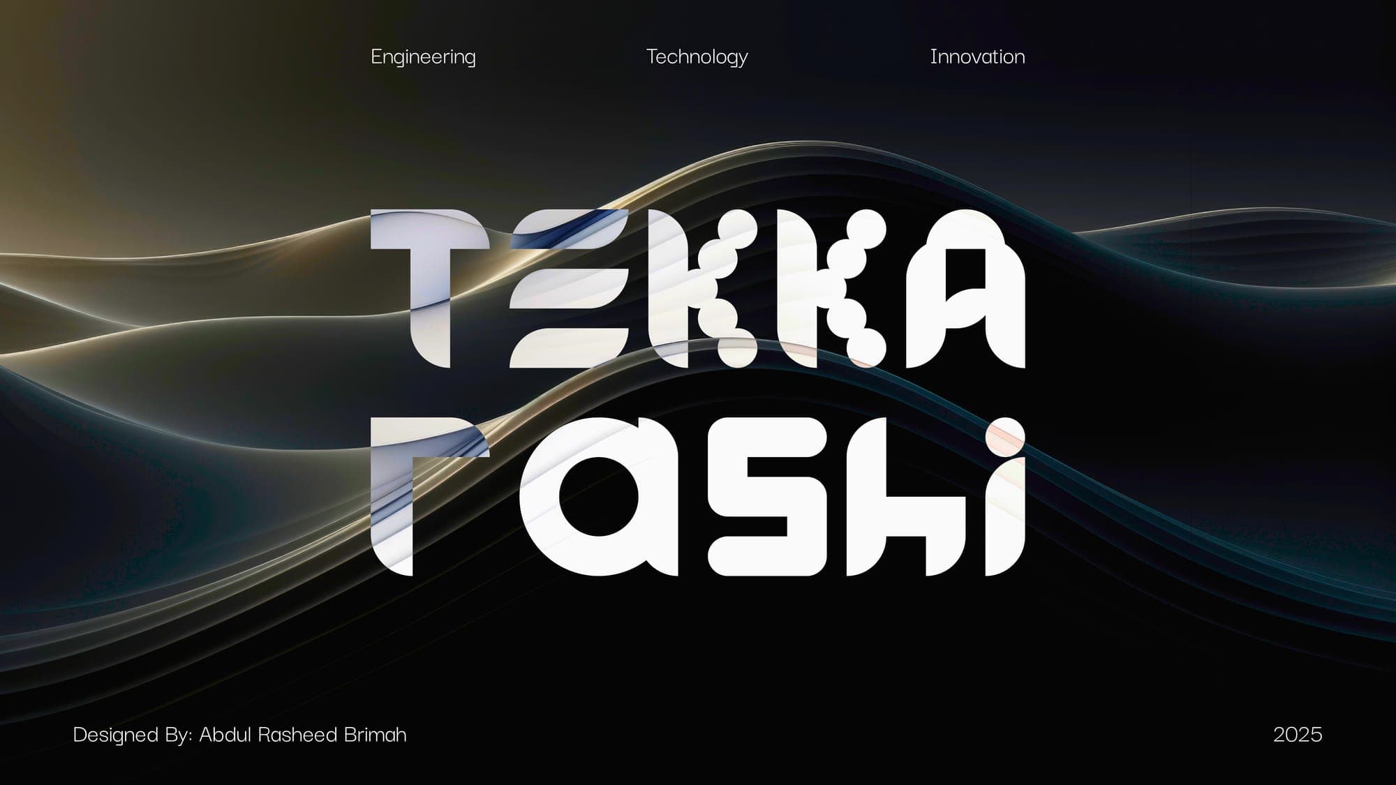
My first identity as Tekkarashi: one name, built from shapes, carrying design, tech and engineering.
- Role
- Designer, my earlier personal brand (2025)
- Discipline
- Brand Identity
- Focus
- Wordmark & Brand Mark, Merch System
- Status
- Live on Behance
01The problem
Before the identity this site wears now, this was how I showed up as Tekkarashi, the name I work under: a graphic designer, engineer and tech enthusiast who also teaches, writes and codes. A jack of all trades, striving to be a master of at least one. The brand had to hold all of that without turning into noise, and stand out on its own the way I want my clients' identities to stand out.
02Key decisions
- 01
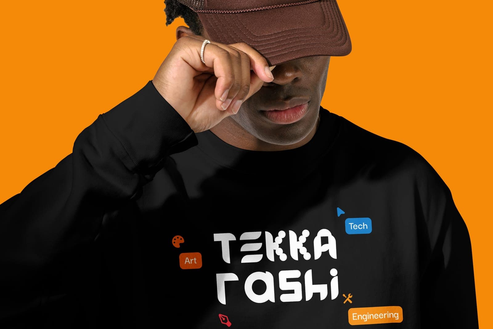
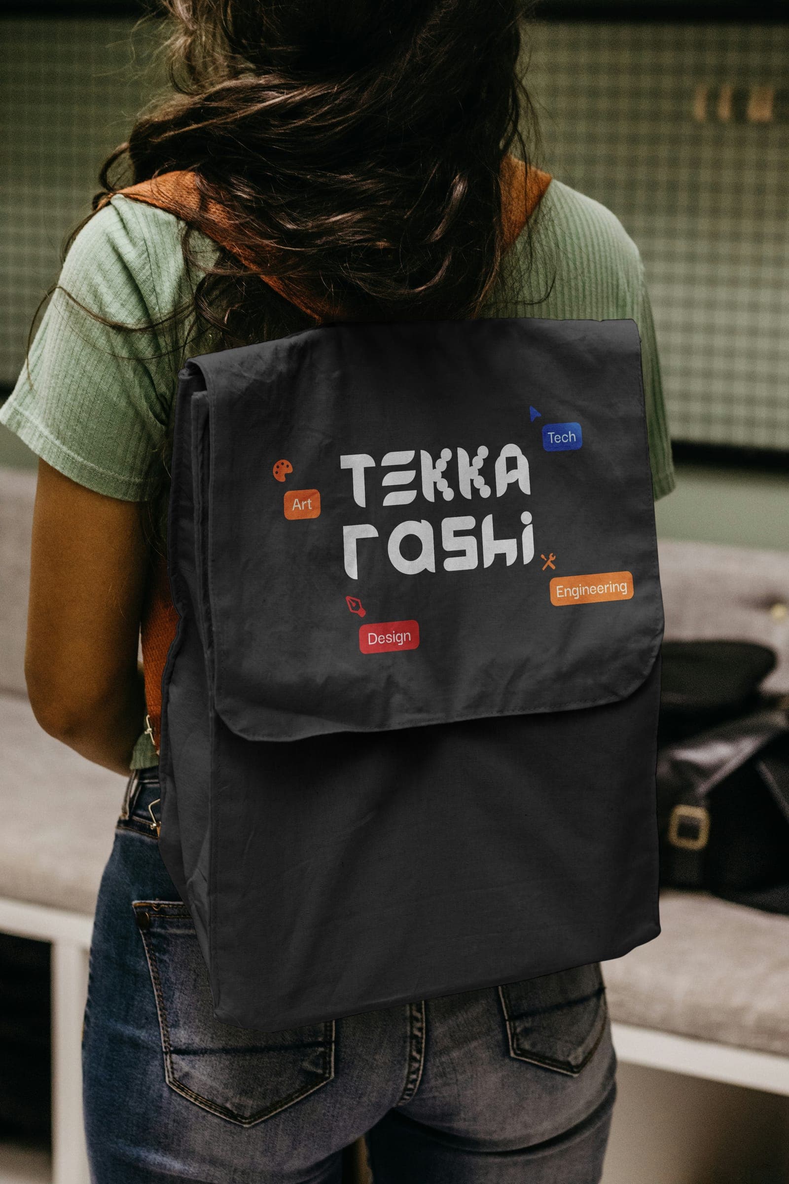
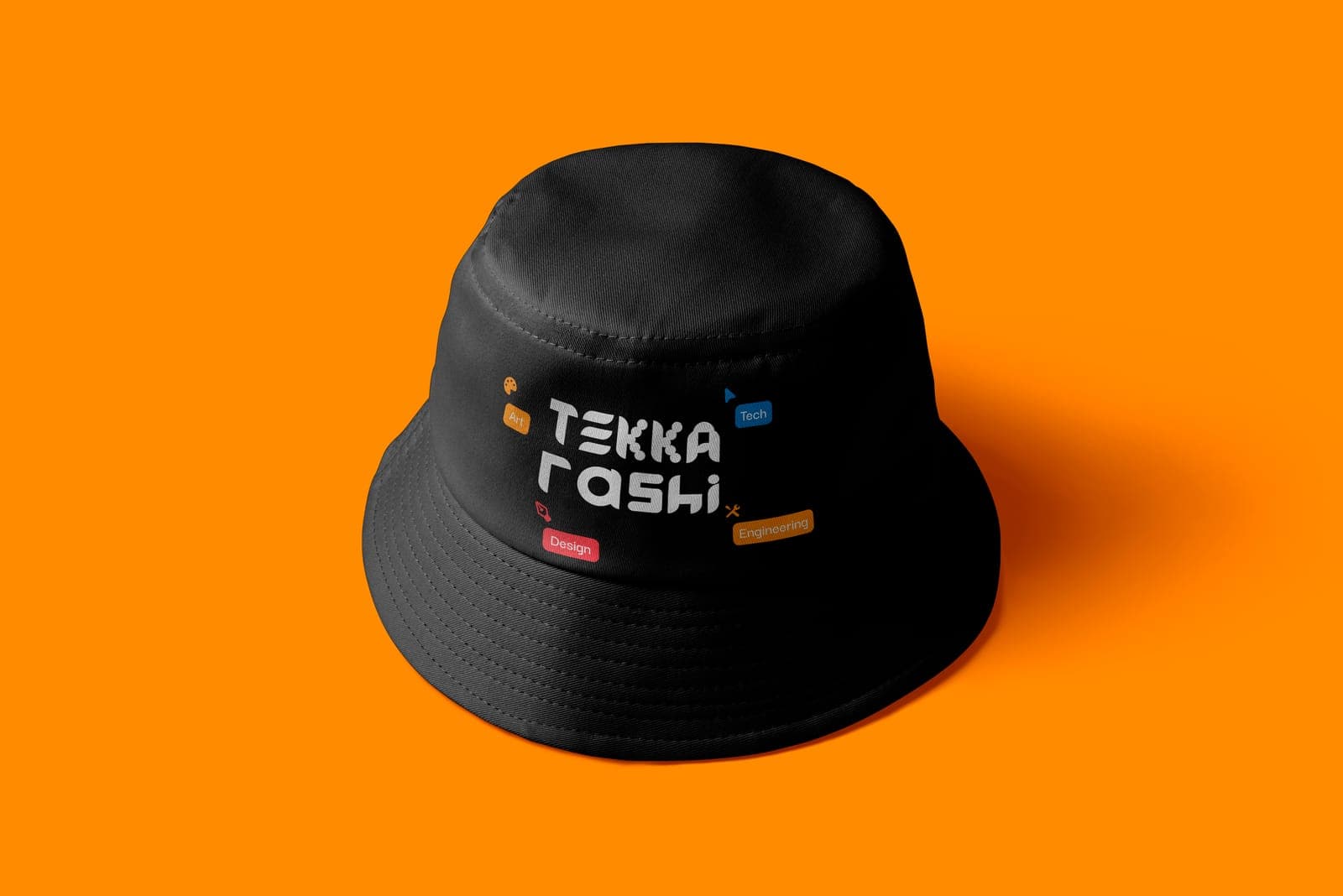
The logo is geometric, built from simple shapes: the full name, Tekkarashi, set as a stacked wordmark with its own rounded, modular letterforms, so it reads as made rather than typed.
- 02
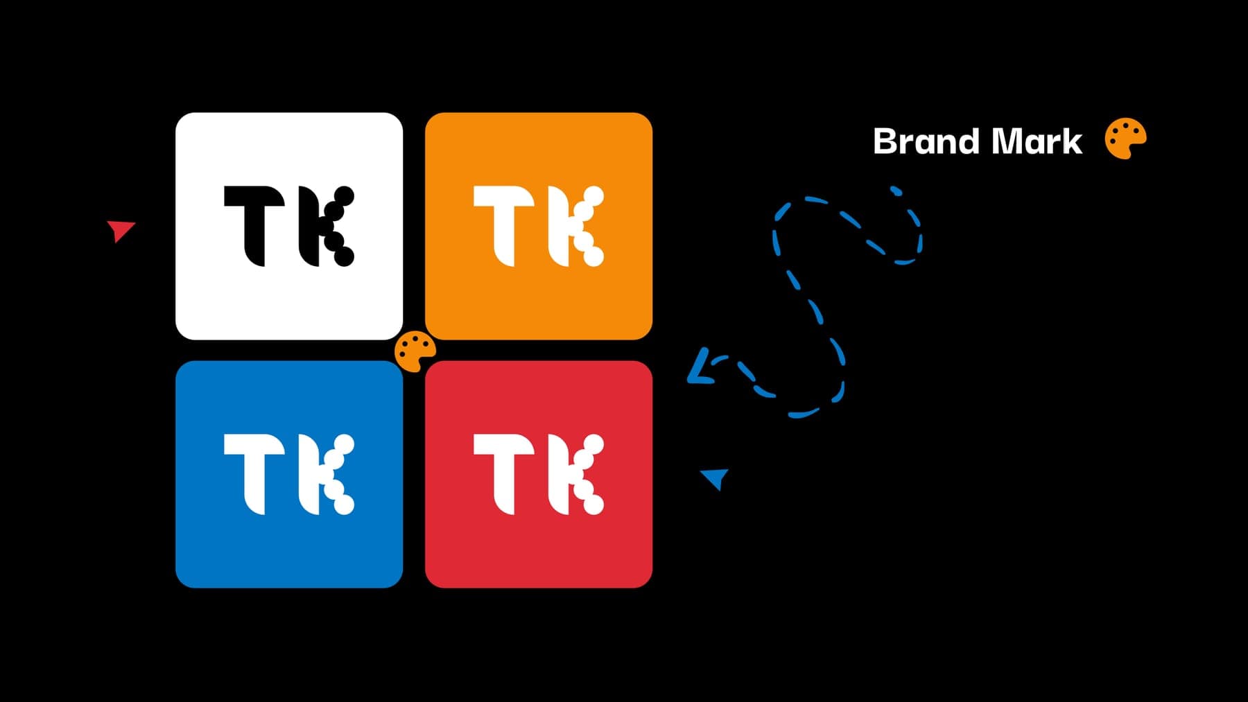
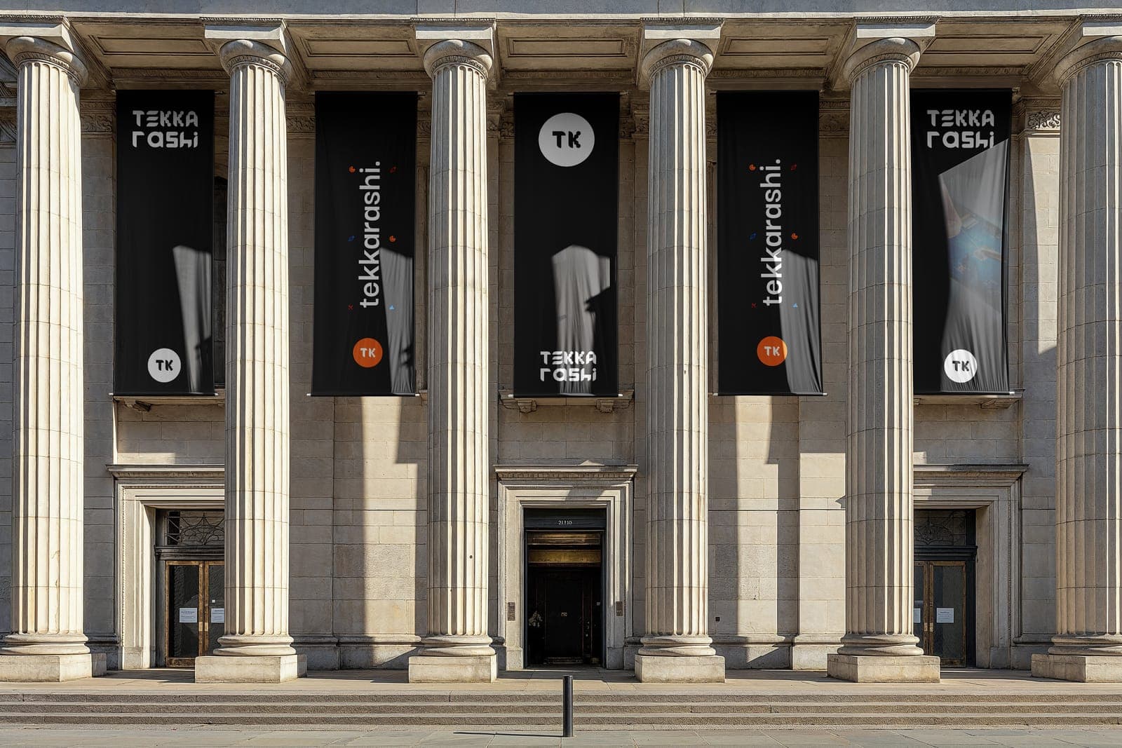
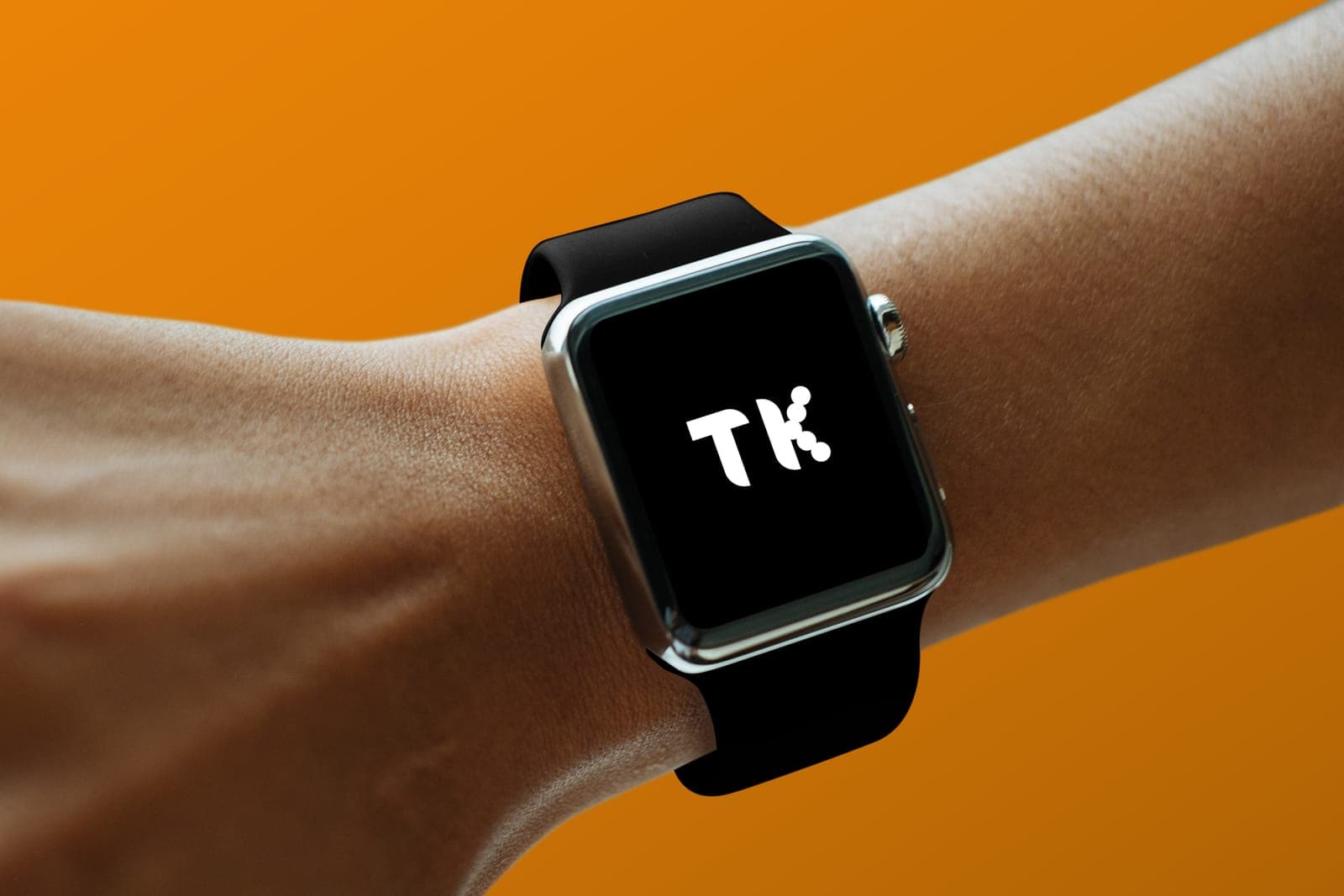
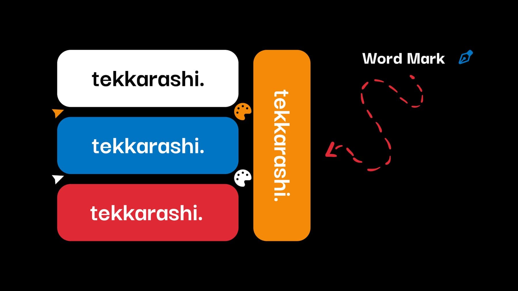
One name, several marks. Alongside the full logo there's a TK brand mark and a lowercase tekkarashi. word mark, so the identity scales down to an app icon, a watch face or a hang tag without losing itself.
- 03
A black base with tangerine, ocean blue and crimson as accents, small tag-like labels (Art, Design, Tech, Engineering) orbiting the wordmark, and Darker Grotesque as the typeface, bold and geometric to match the mark.
03Outcome
A complete personal identity: primary logo, brand mark, word mark, colour and type, carried across merch, signage and social presentation. It has since made way for my current identity, but it's work I still stand behind.