Design — Student chapter identity
IEEE PES UNILAG
A chapter identity that sits under IEEE and still feels like UNILAG.
- Role
- Brand identity designer
- Discipline
- Brand Identity
- Focus
- Monogram, Campaign
- Status
- Live on Behance
01The problem
IEEE PES UNILAG — the University of Lagos student chapter of the IEEE Power & Energy Society — needed an identity of its own. It had to sit comfortably under the IEEE PES parent brand, yet still feel like a chapter students want to join, across everything a chapter actually puts out: merch, signage, certificates and event campaigns.
02Key decisions
- 01
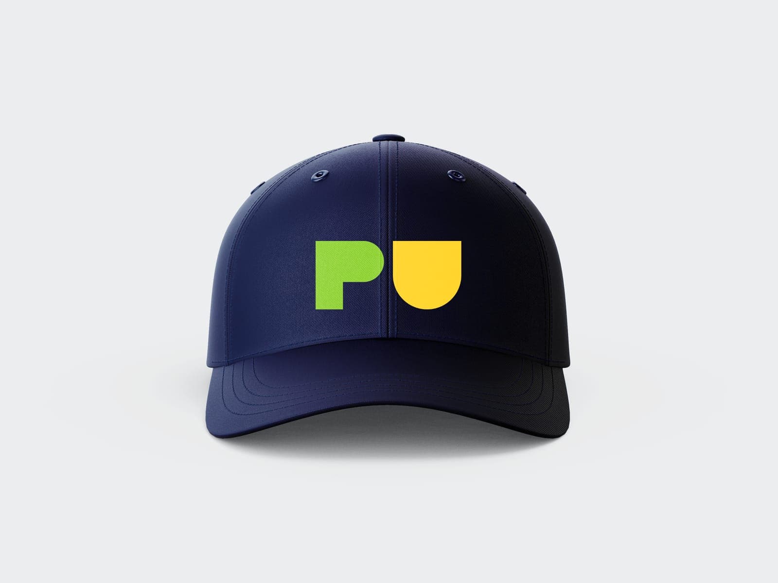
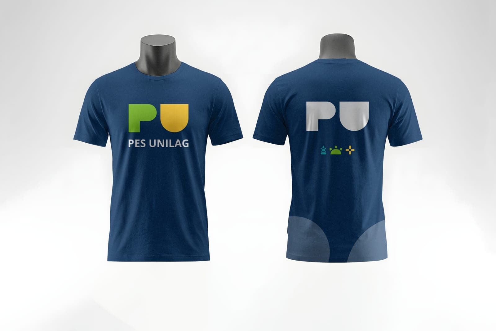
The PU monogram is built from two simple blocks — a P and a U drawn from the same rounded geometry — so it reads instantly at the size of a cap badge and still holds up on a building sign.
- 02
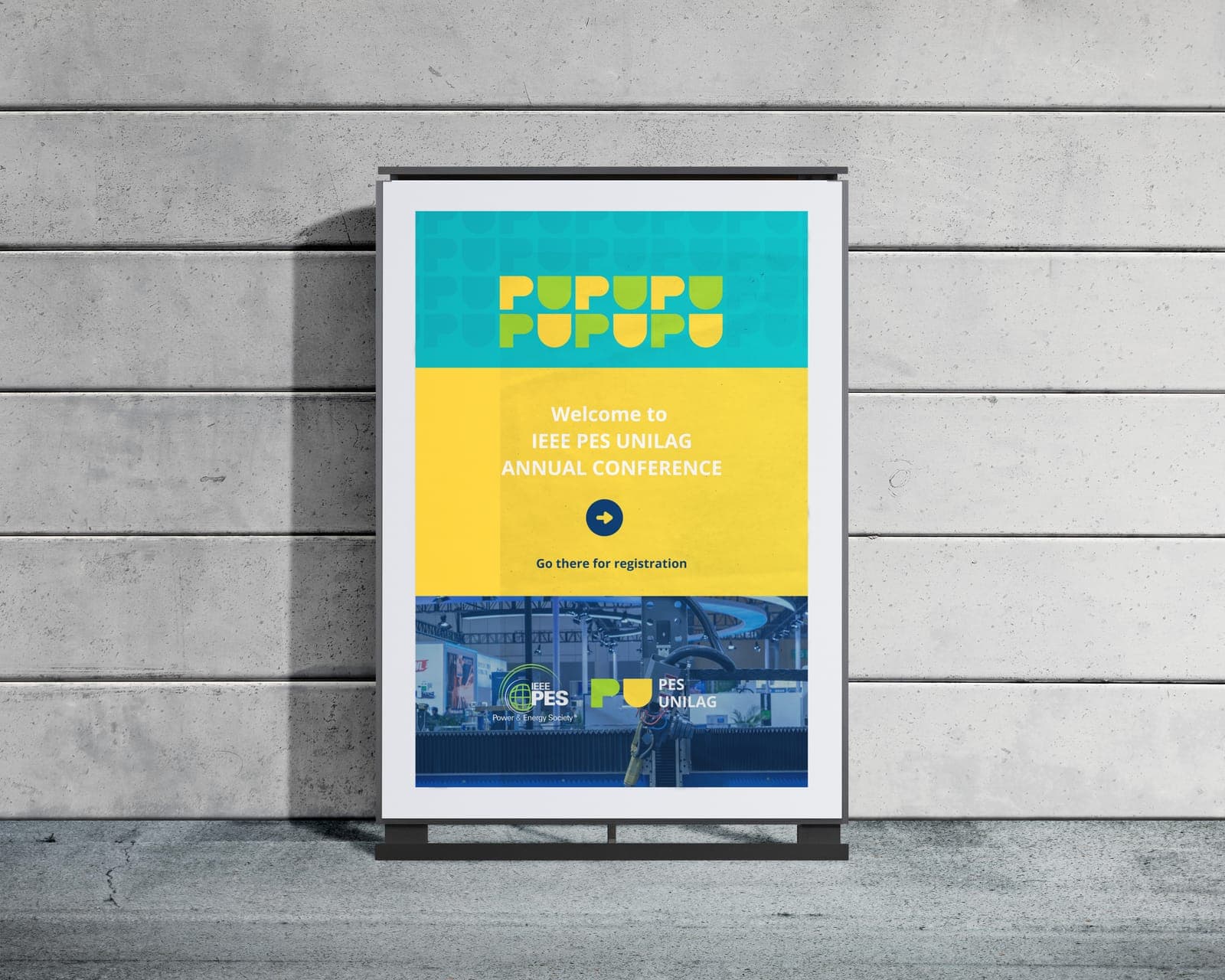
Lime and sun yellow sit on IEEE blue, keeping the chapter inside the parent brand's world while giving it a voice of its own. Repeated, the P and U become a pattern that can carry the brand without the logo.
- 03
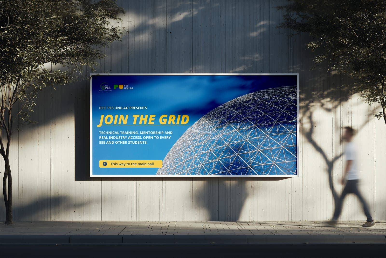
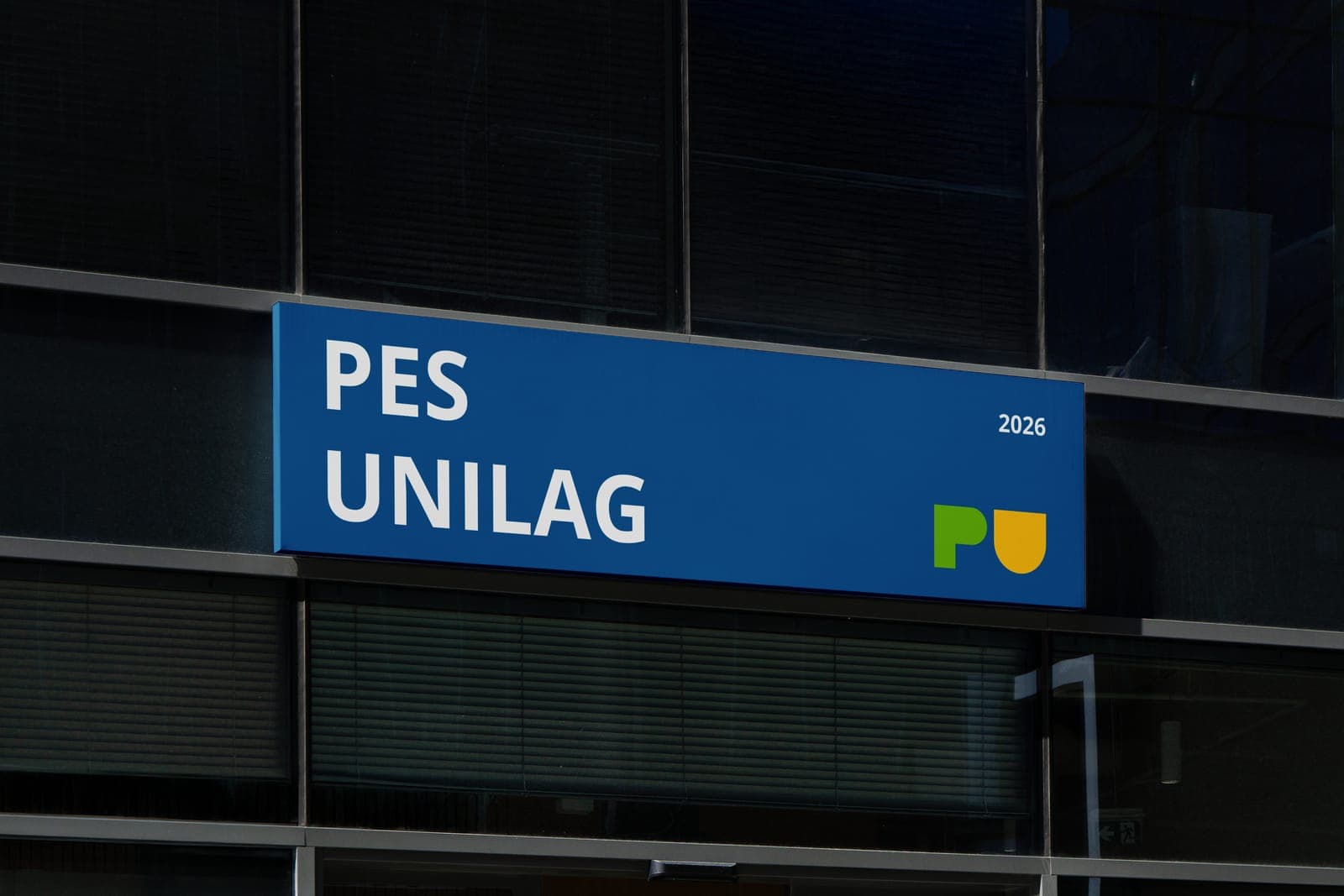
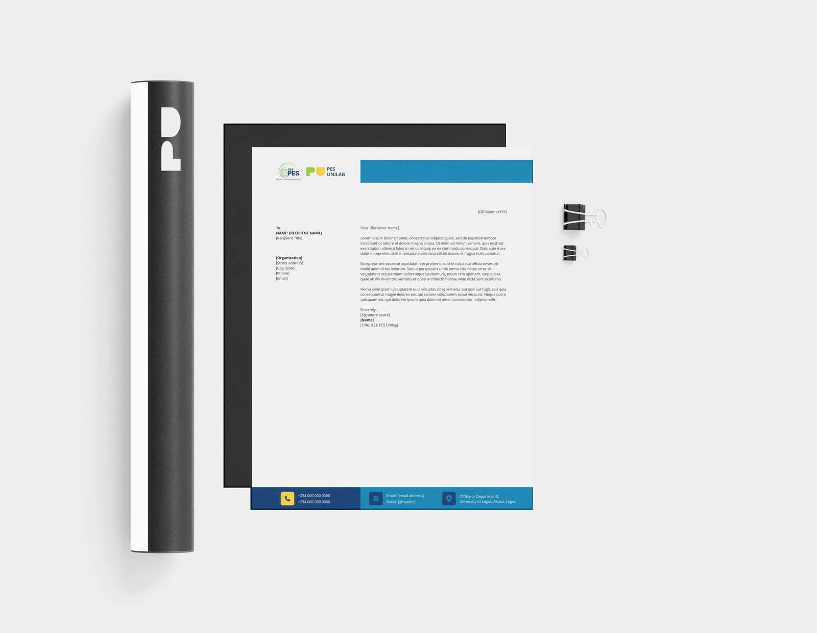
Built to be used, not just presented: caps, tees and polos, a shopfront sign, stationery, certificates, and a “Join the Grid” campaign across billboards, roll-ups and posters.
03Outcome
A full chapter identity — monogram, colour system and pattern — rolled out across merch, signage, stationery, certificates and event campaigns.