Design — Brand identity
Recova
An AI recovery companion that trades clinical cold for hope.
- Role
- Brand identity designer
- Discipline
- Brand Identity
- Focus
- Mark Construction, Social System
- Status
- Live on Behance
01The problem
Recova is an AI-driven recovery companion. Recovery brands tend to look clinical, and that coldness reads as judgment. Recova's identity had to replace those clinical stereotypes with a friendly, judgment-free approach, while still earning the trust a healthcare brand depends on.
02Key decisions
- 01
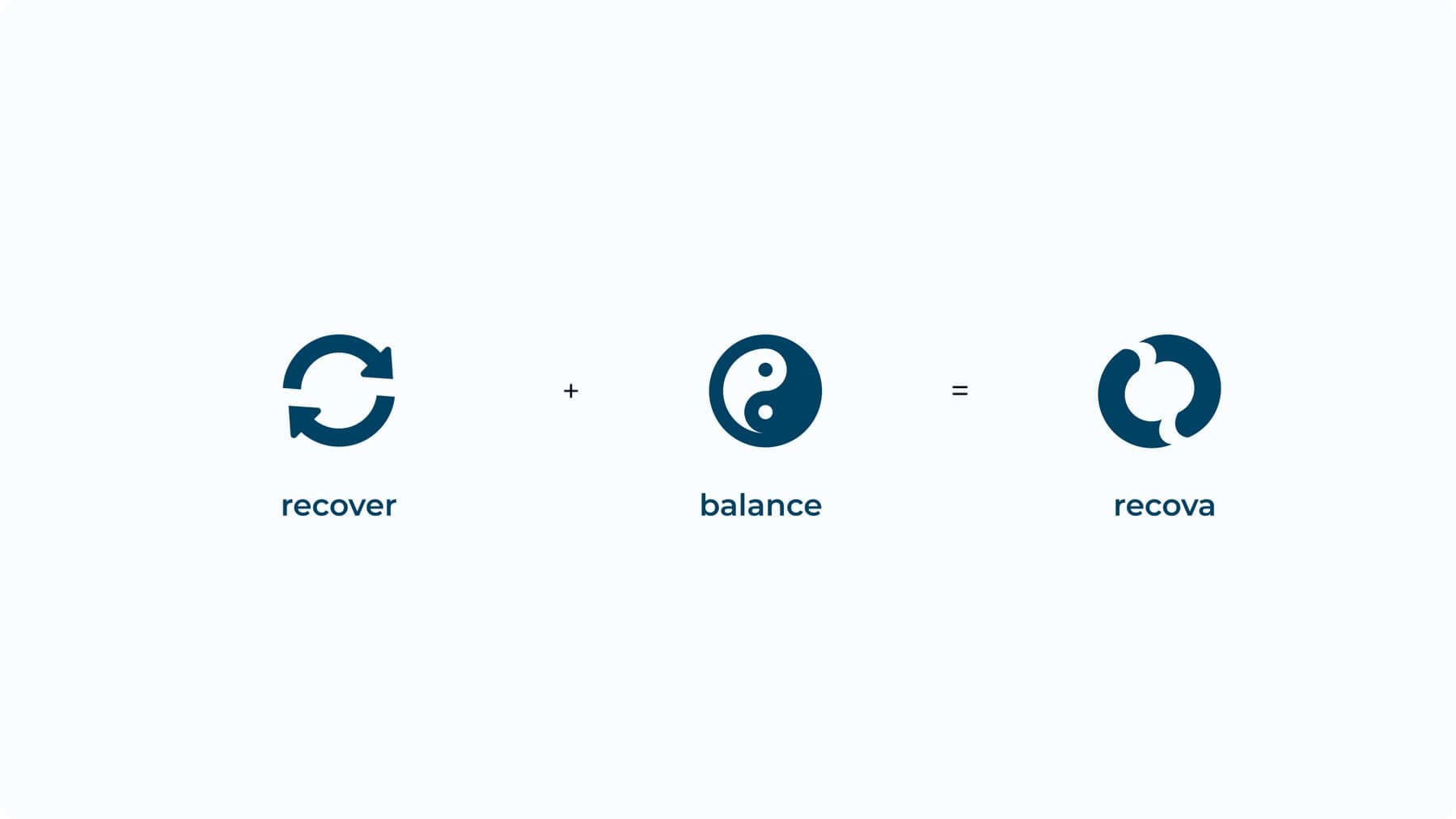
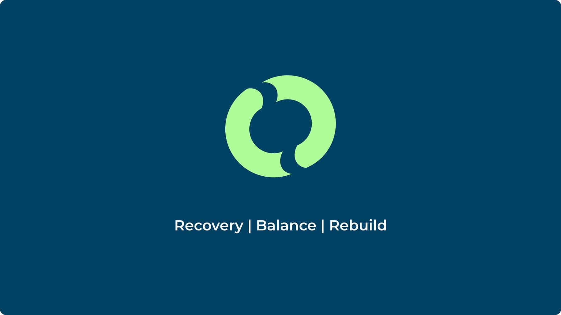
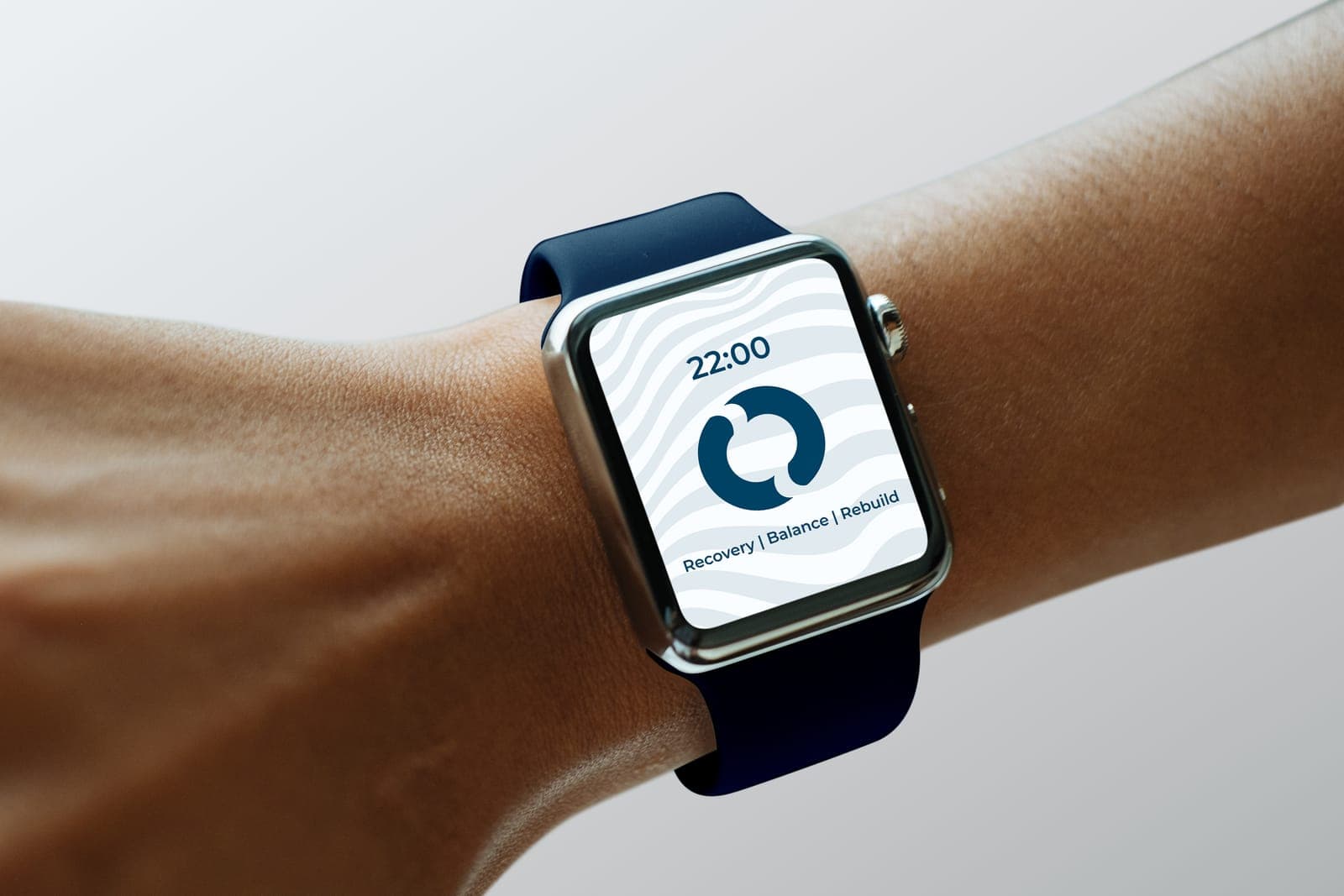
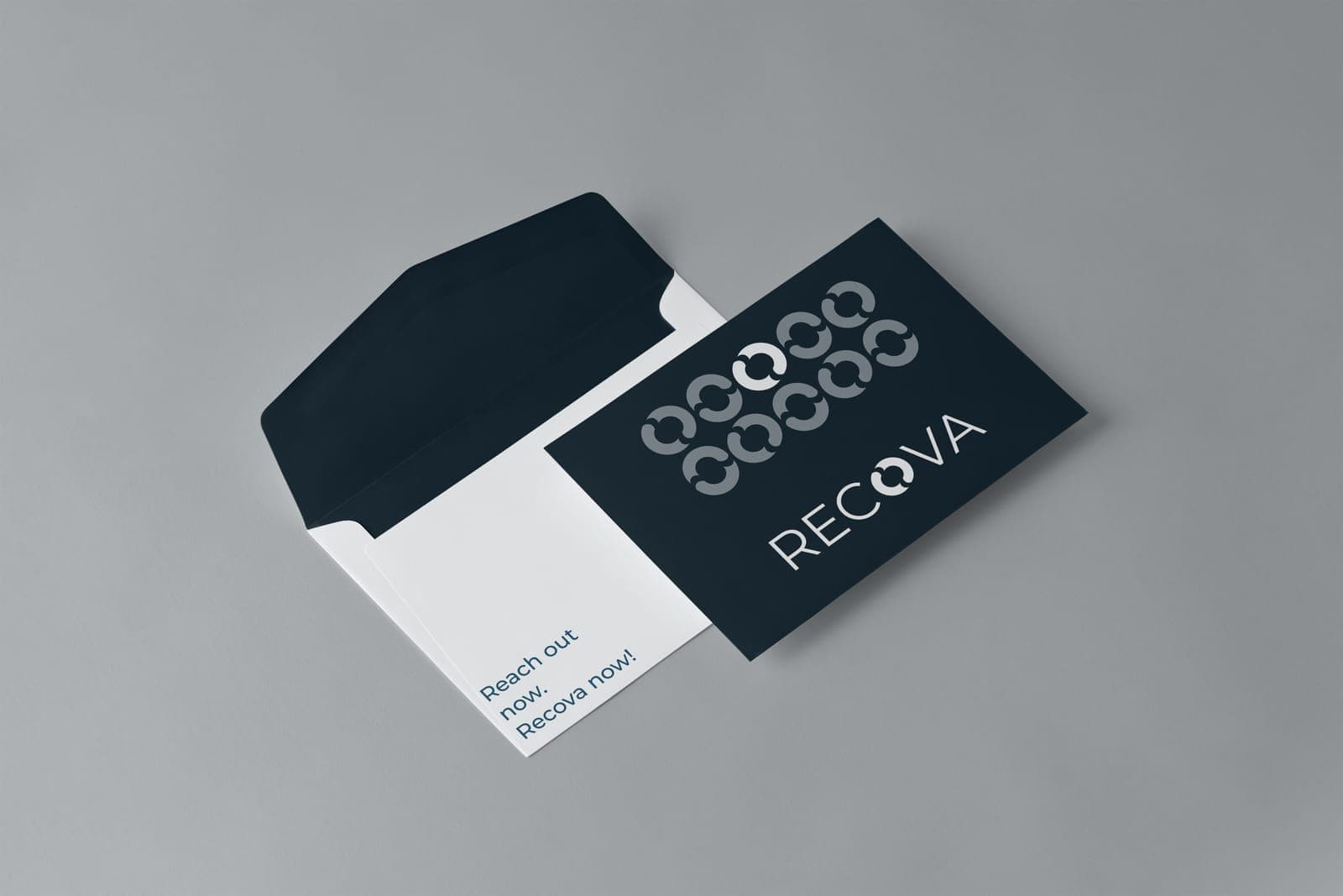
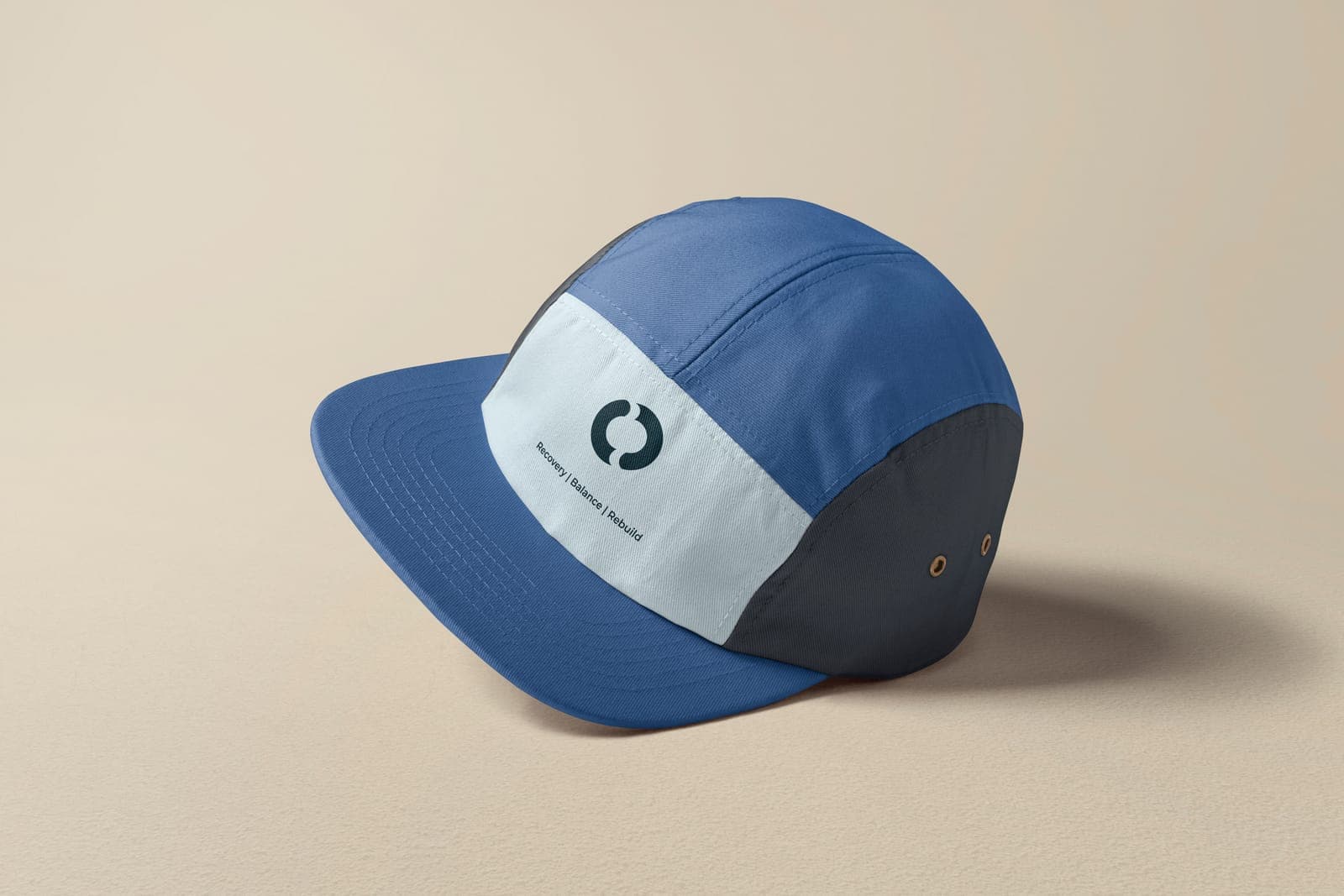
The mark is built from two ideas, a recover cycle and a balance symbol, folded into one looping form, so the logo itself reads as recover + balance = Recova, carried by the line Recovery | Balance | Rebuild.
- 02
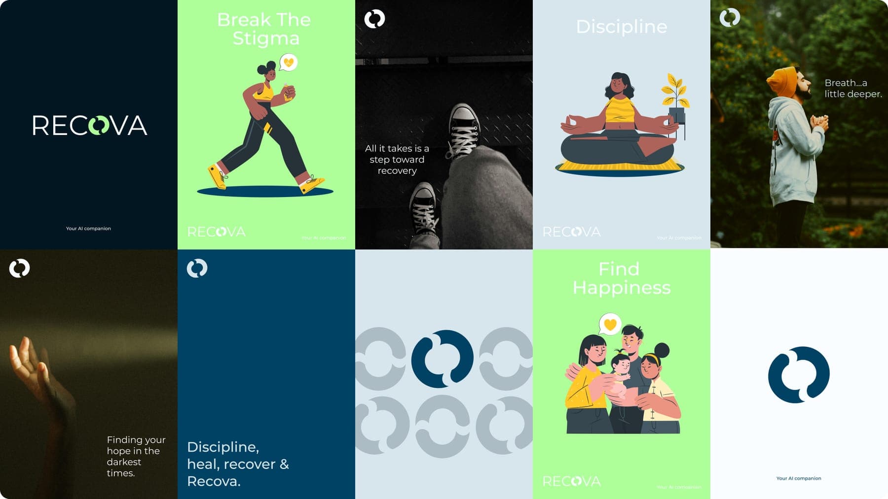
Bold colour and confident type carry strength and optimism: Prussian Blue and Rich Black for trust, Menthol green for warmth and energy, Azureish and Neon White for room to breathe, all set in Montserrat.
- 03
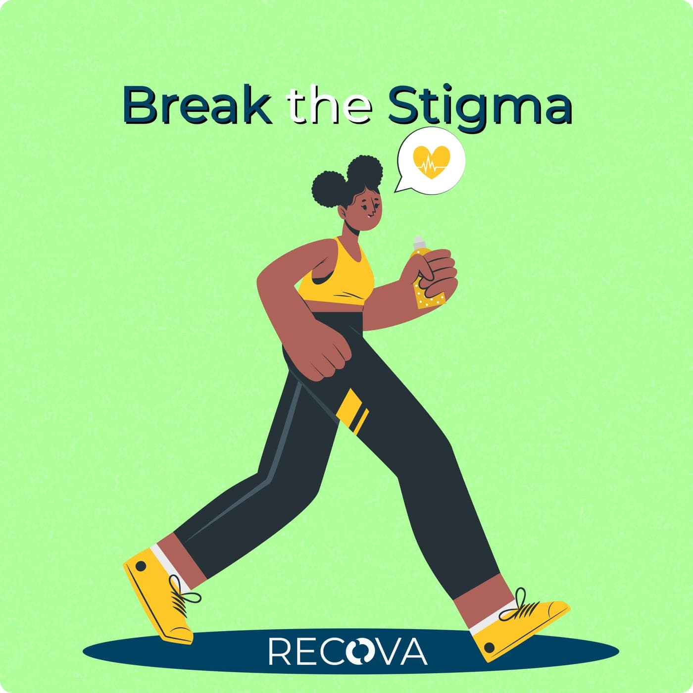
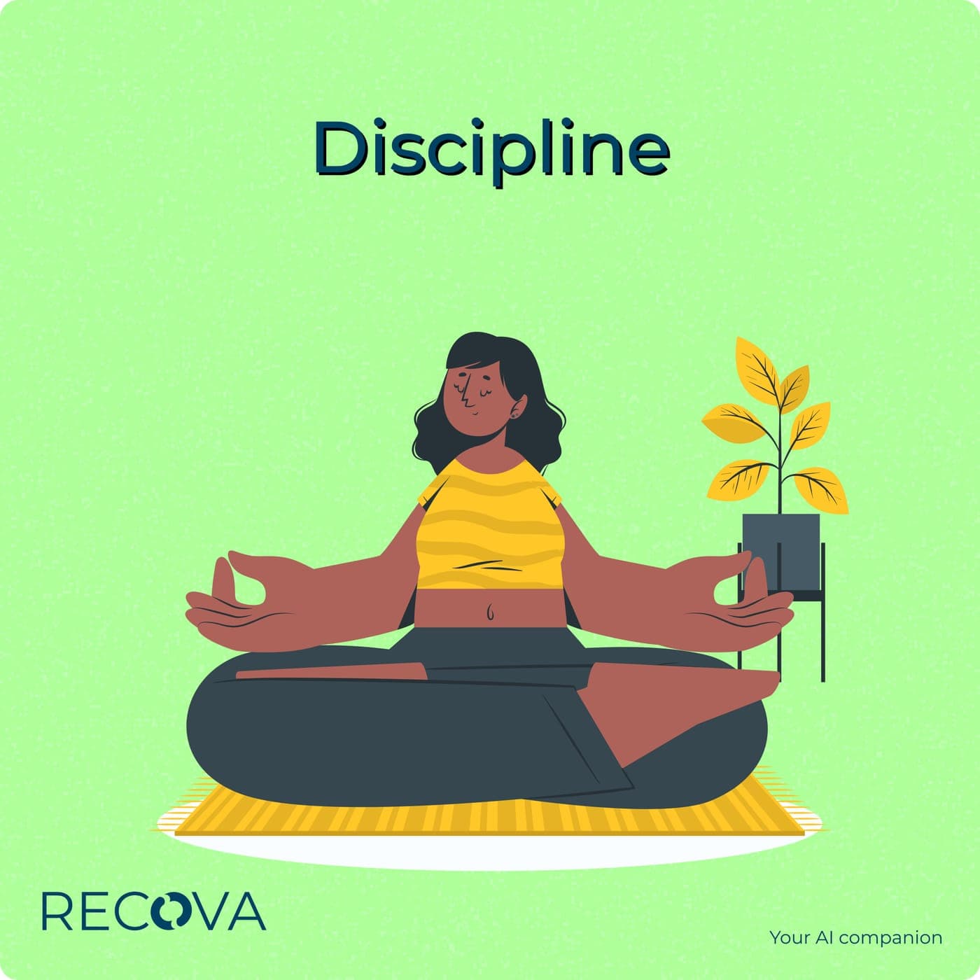
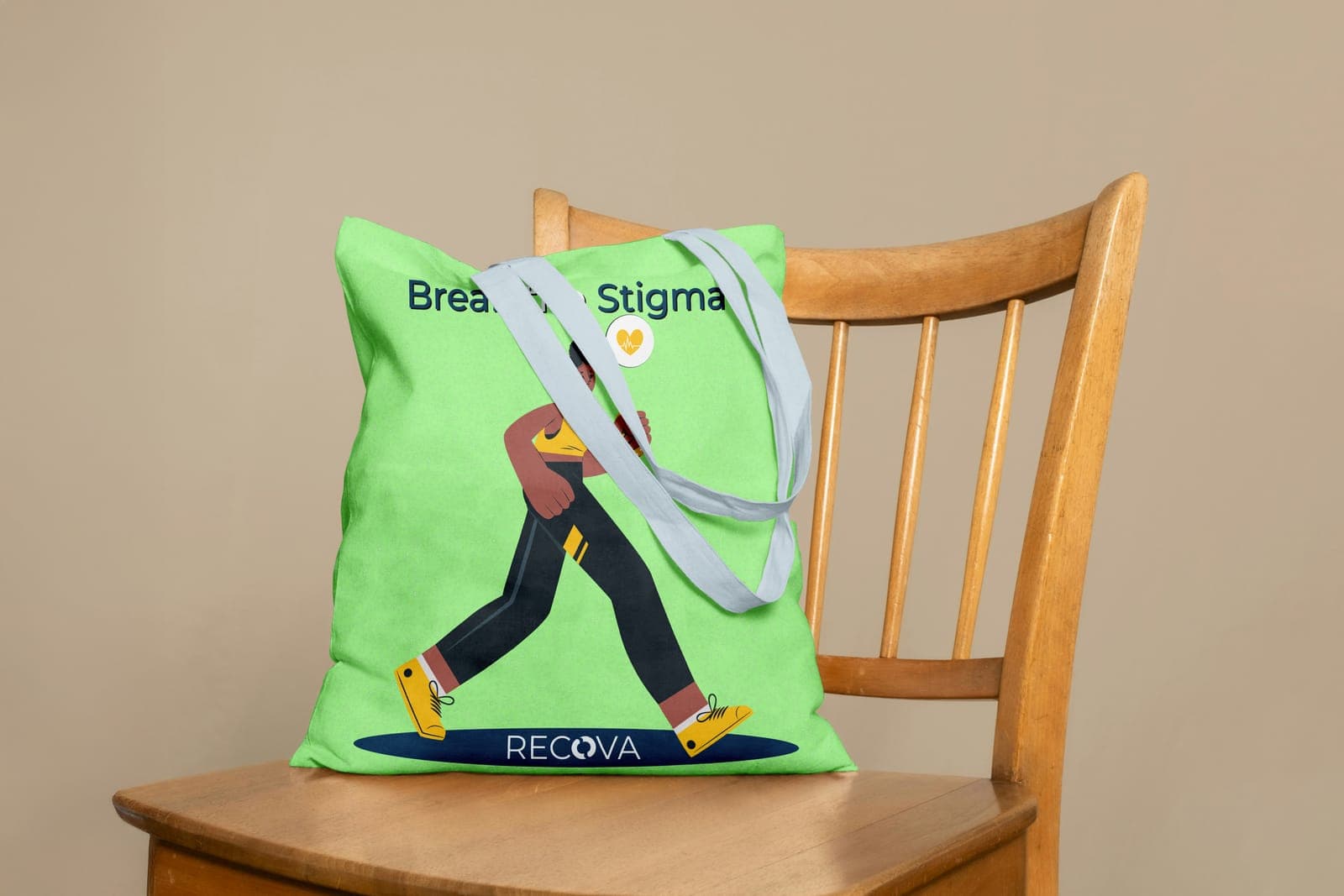
Friendly illustration does the stigma-breaking work on social (Break the Stigma, Discipline) while calm photography and soft wave patterns hold the quieter moments, so the brand balances warmth and boldness instead of picking one.
03Outcome
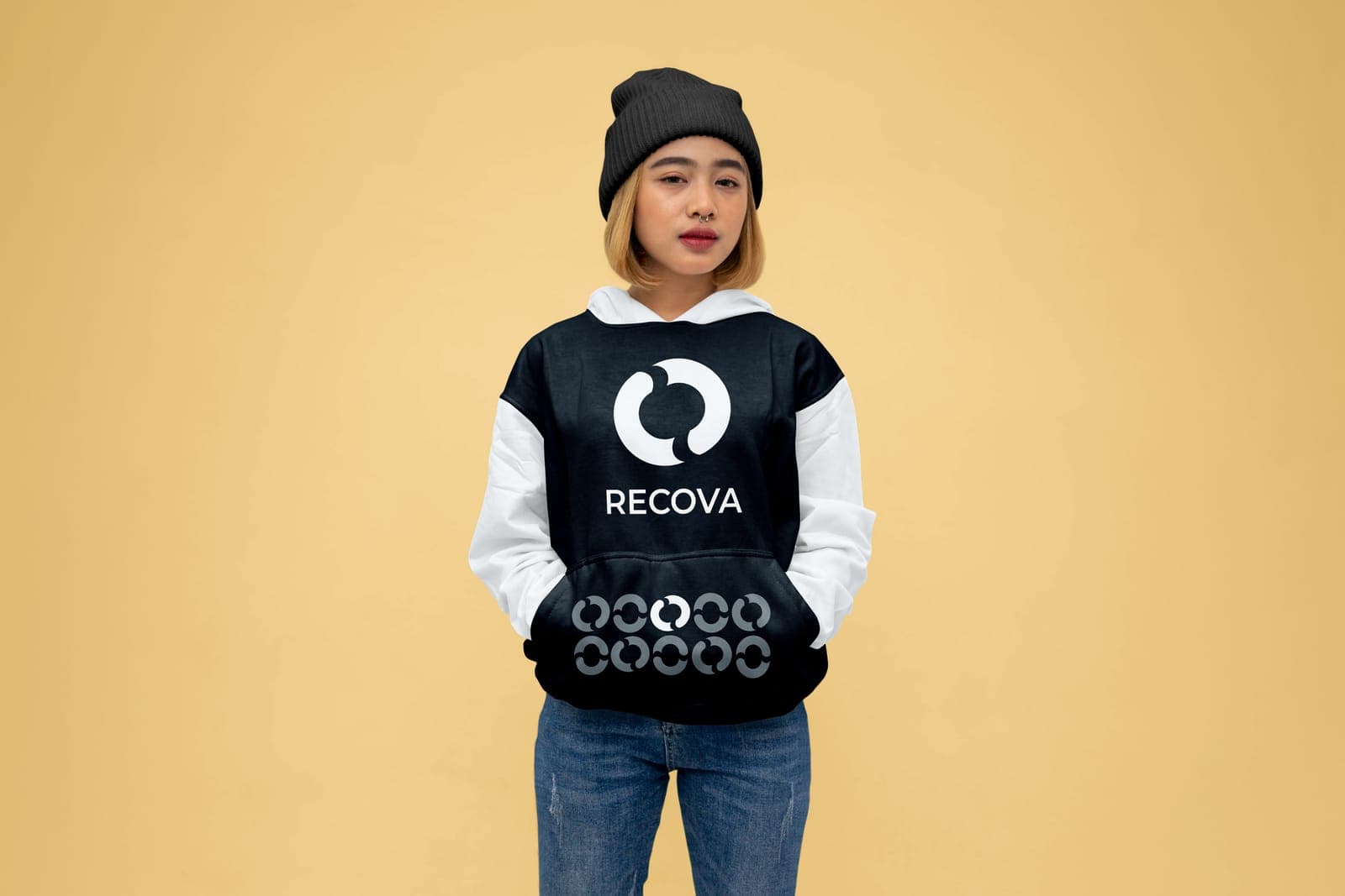
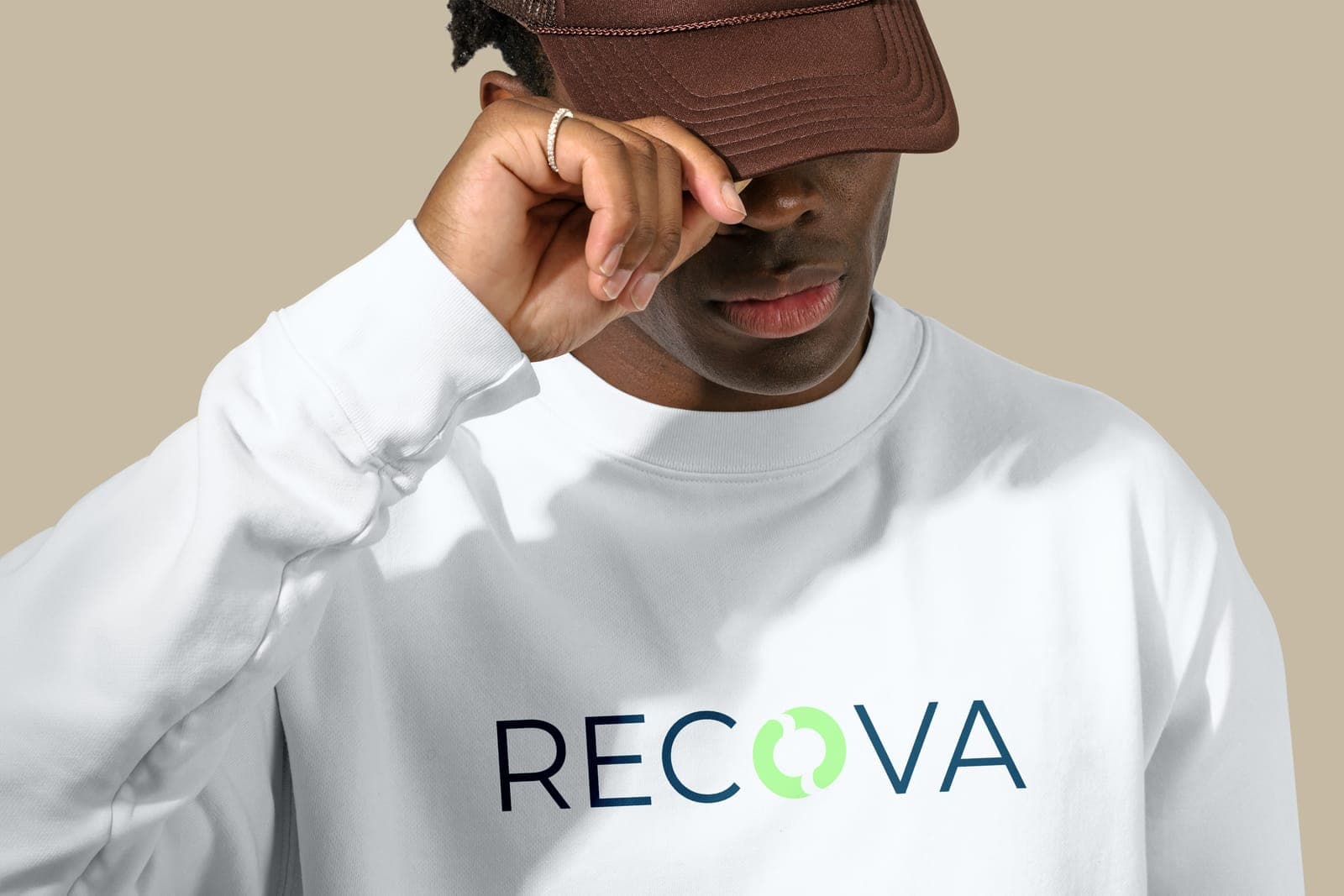
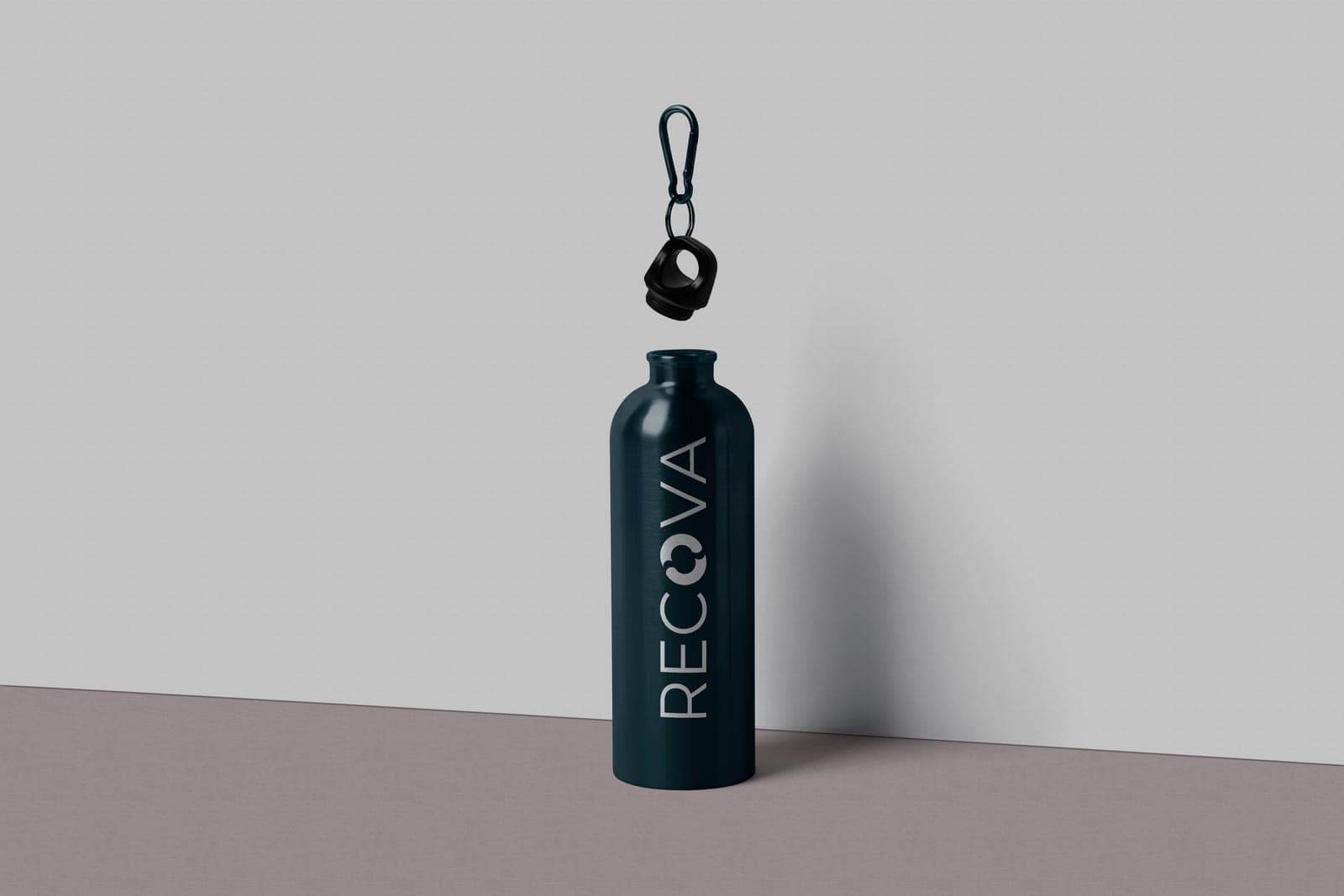
A full identity, from mark and wordmark to palette, type, social templates and merch, built to make recovery feel empowering and accessible.