Design — Brand identity
RecoverIT
Recovery framed as growth and renewal, not a diagnosis.

- Role
- Brand identity designer, leading a 3-person design team
- Discipline
- Brand Identity
- Focus
- Iconography, Naming Framework
- Status
- Live on Behance
01The problem
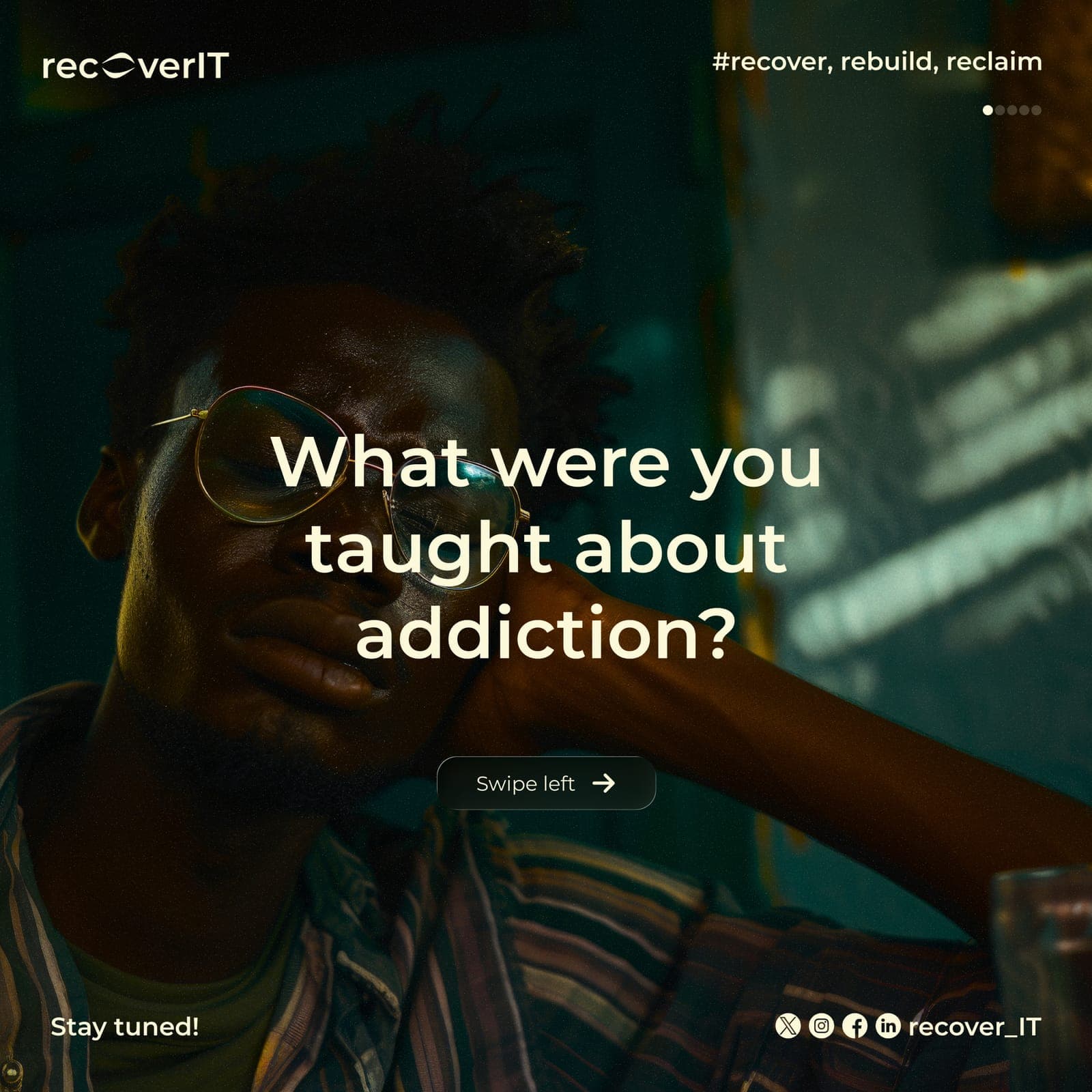
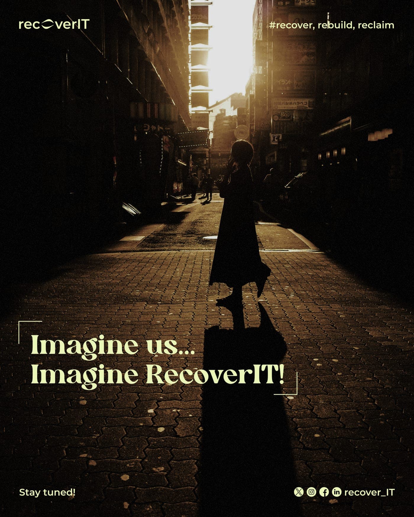
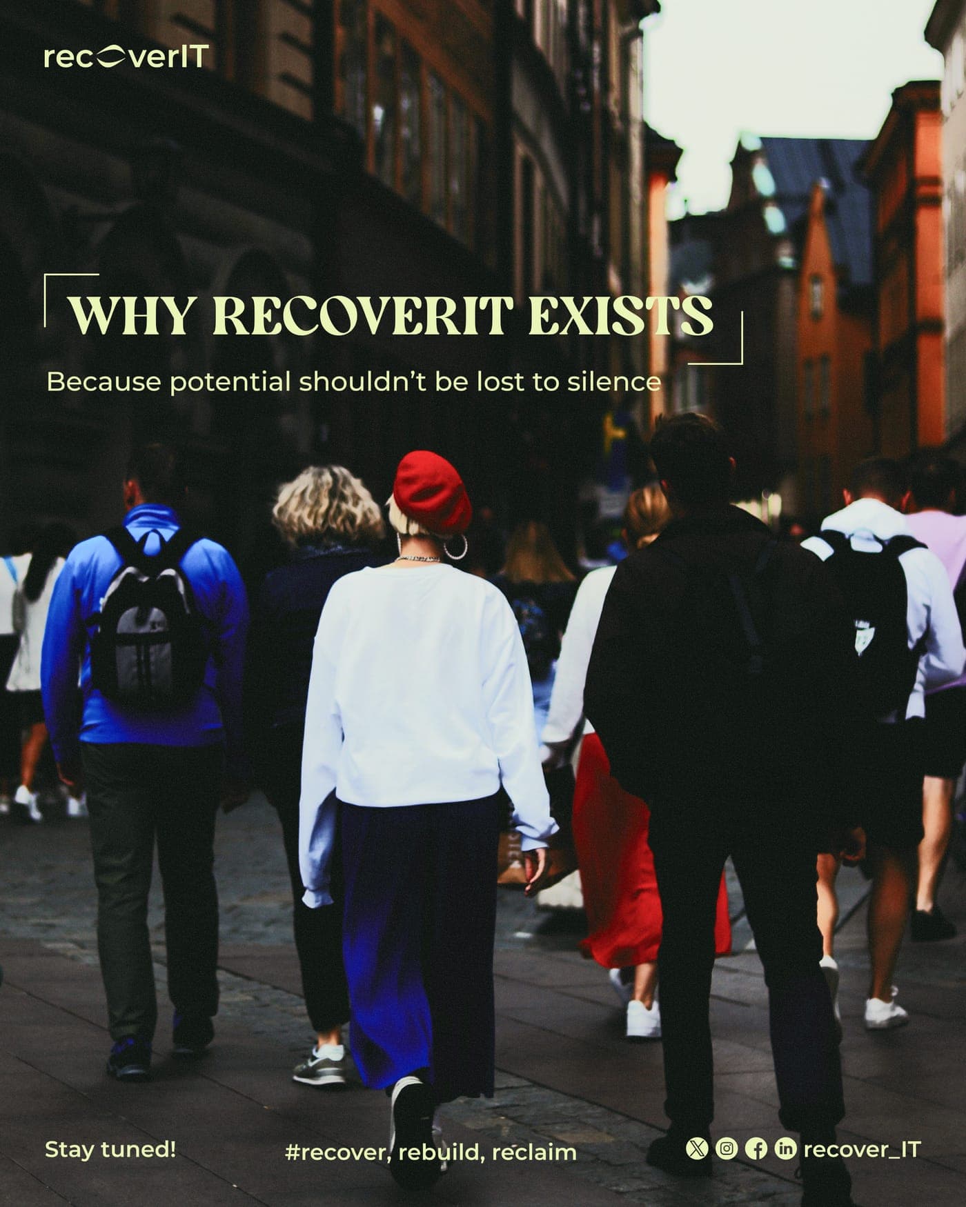
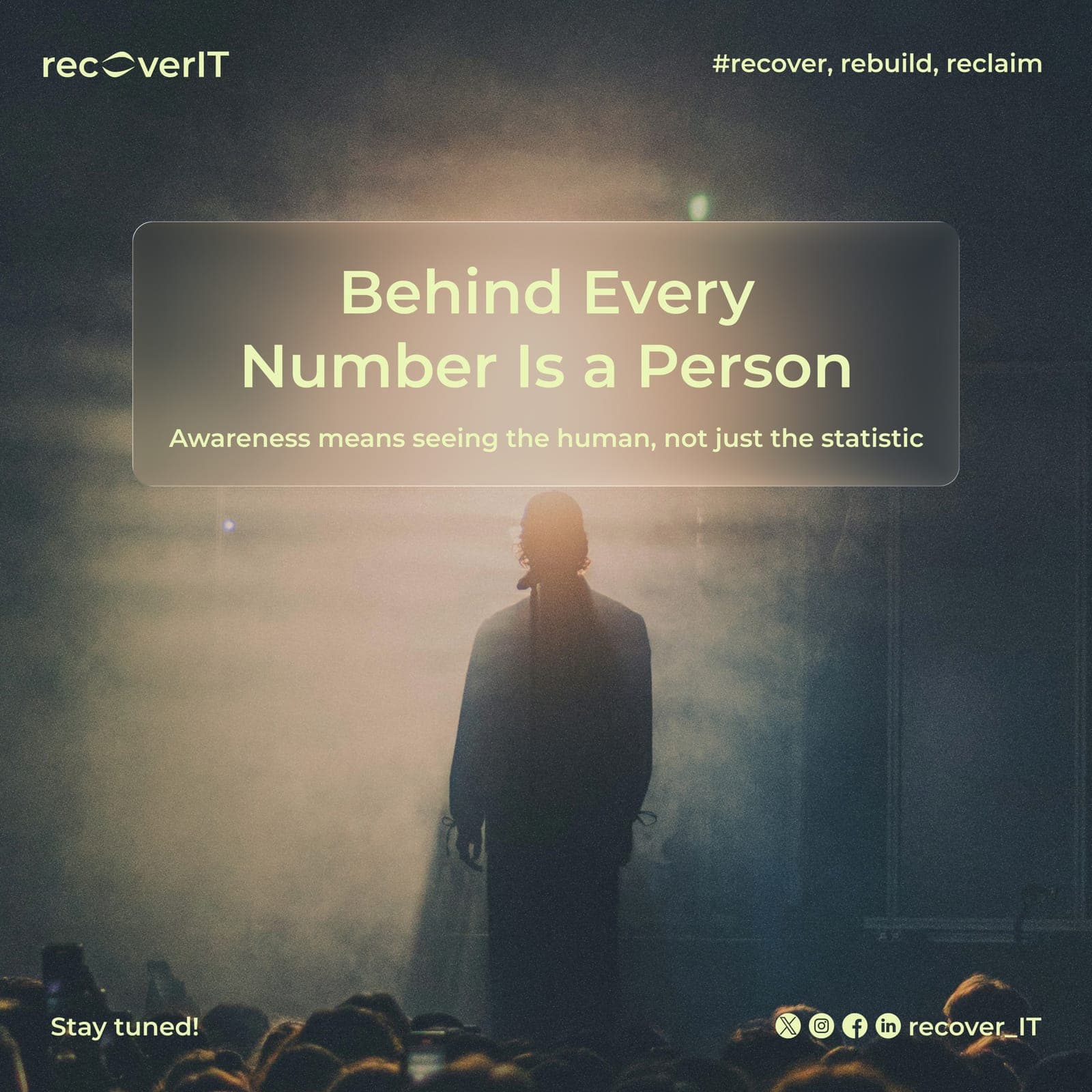
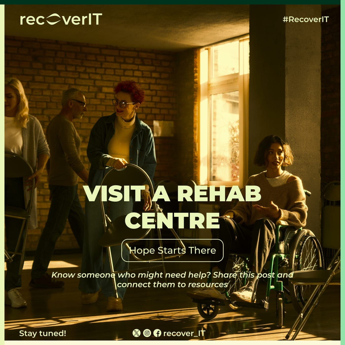
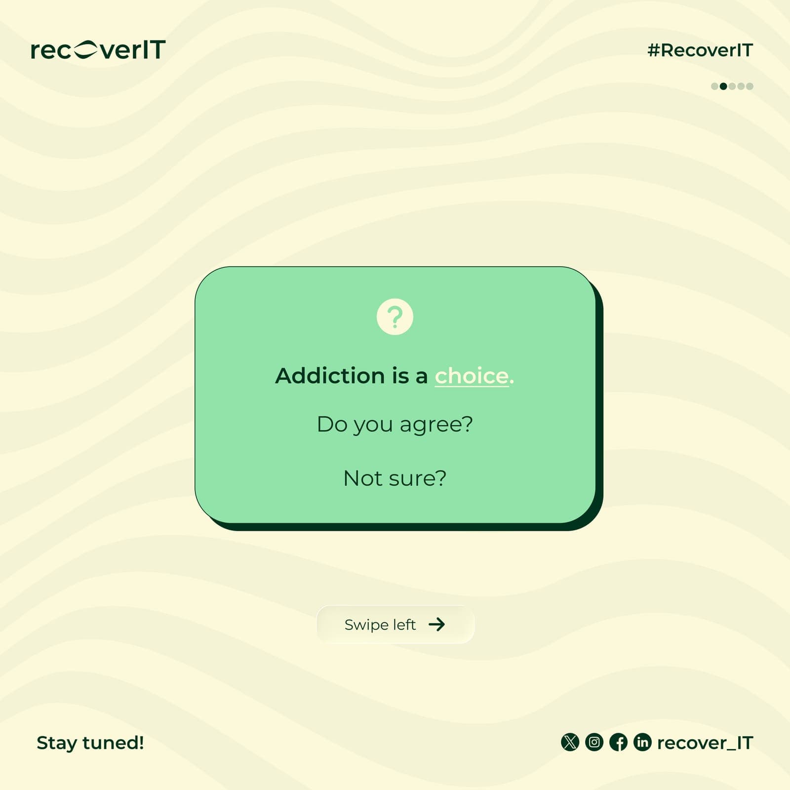
RecoverIT set out to solve a specific problem: addiction recovery tools and support systems are still mostly cold and clinical, and that coldness keeps people from reaching out. The brand needed to feel like a second chance, not a diagnosis.
02Key decisions
- 01
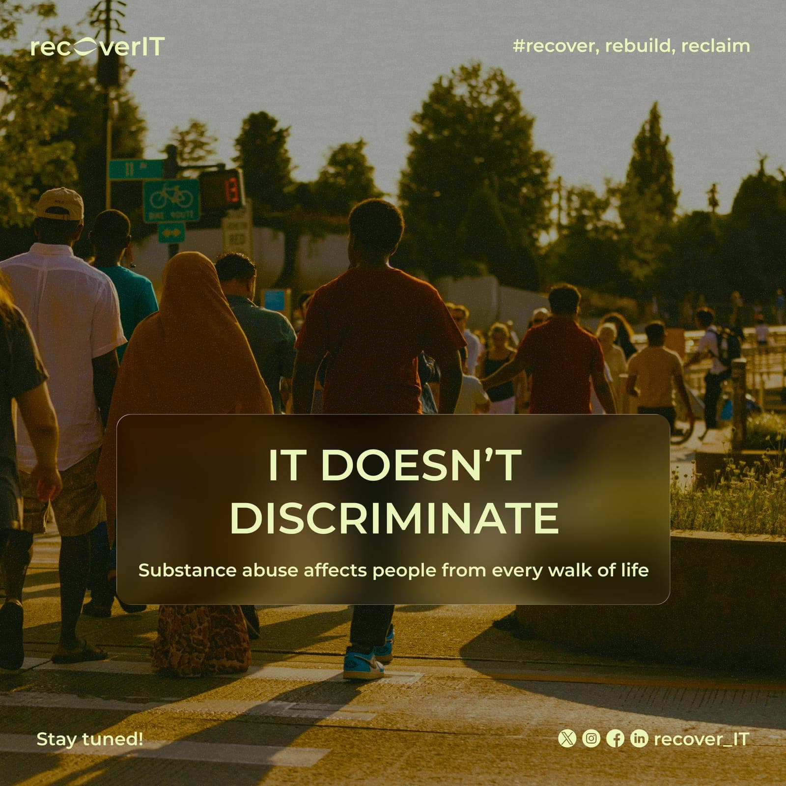
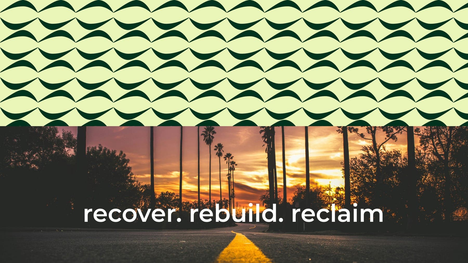
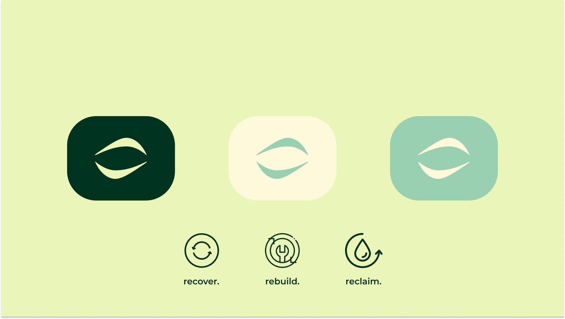
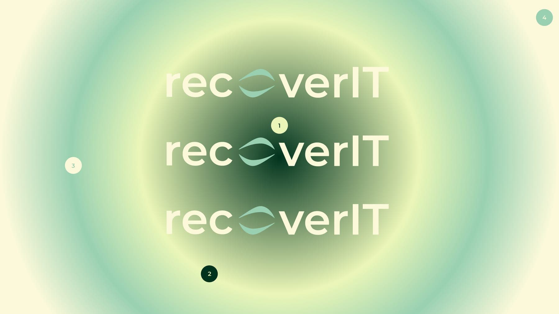
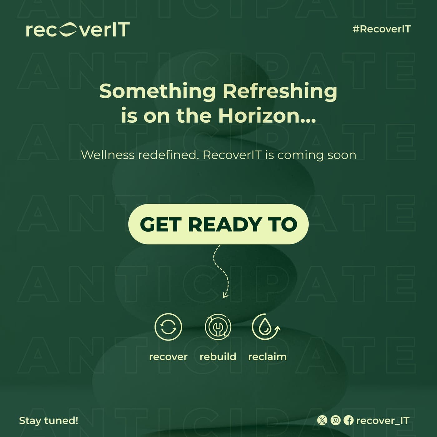
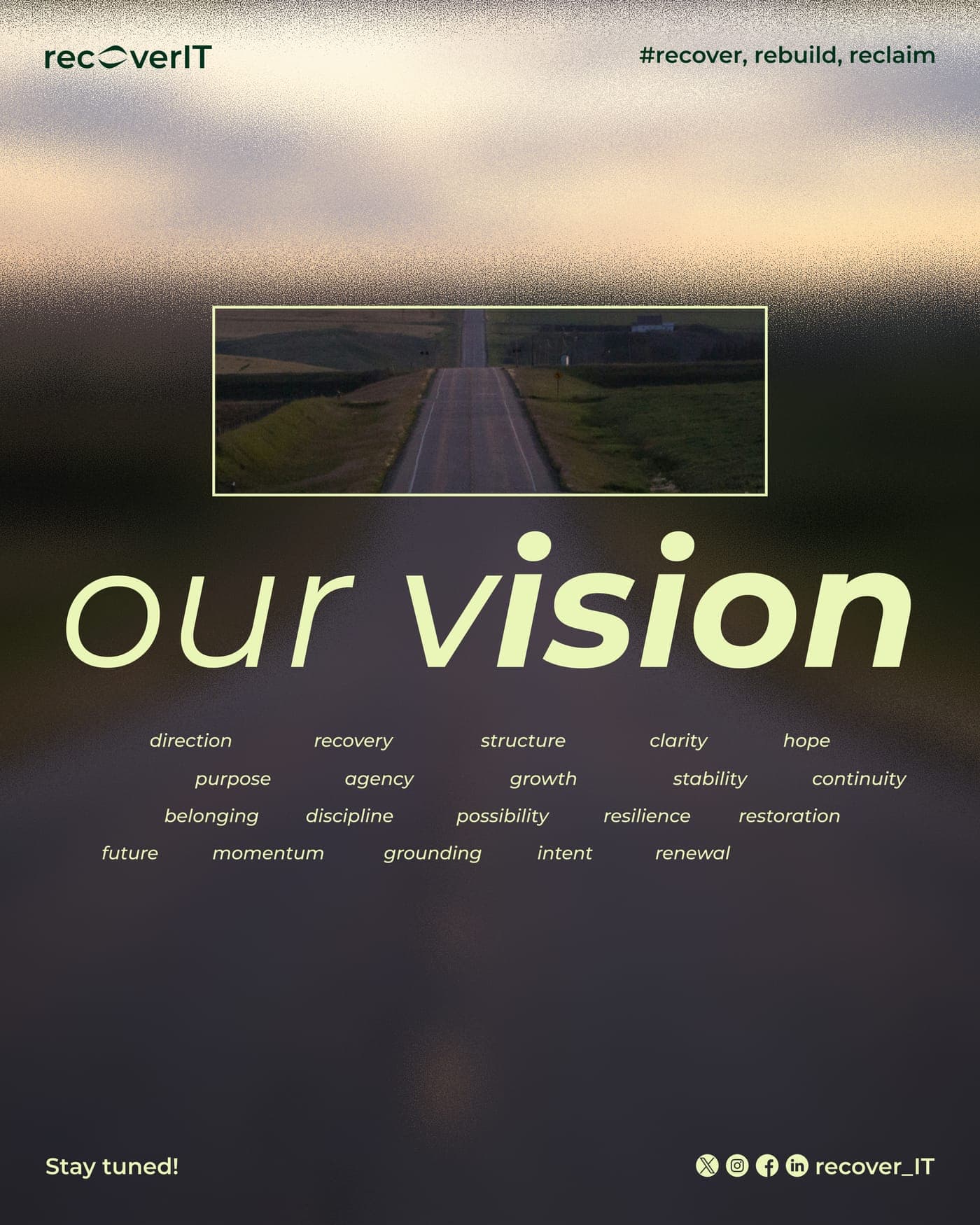
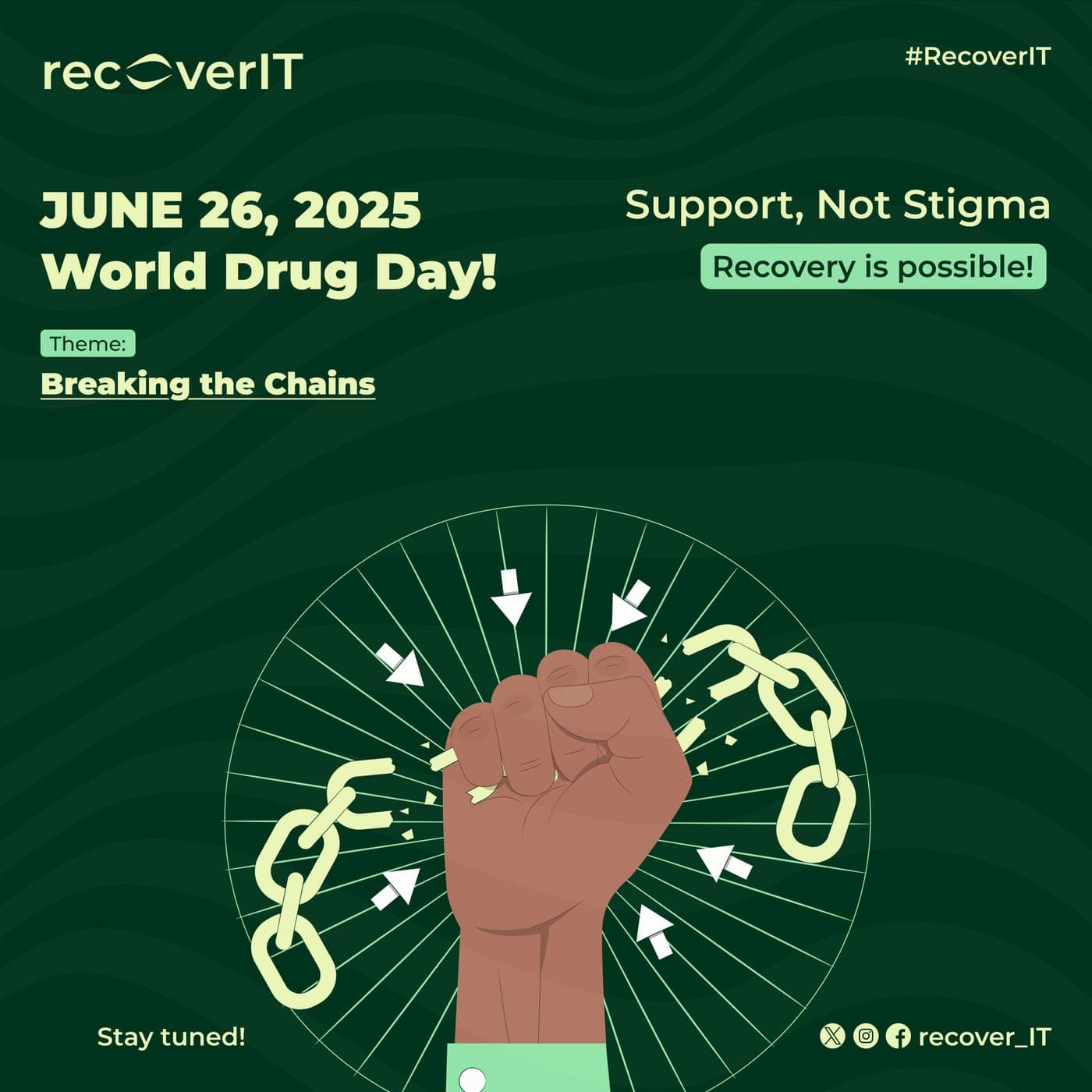
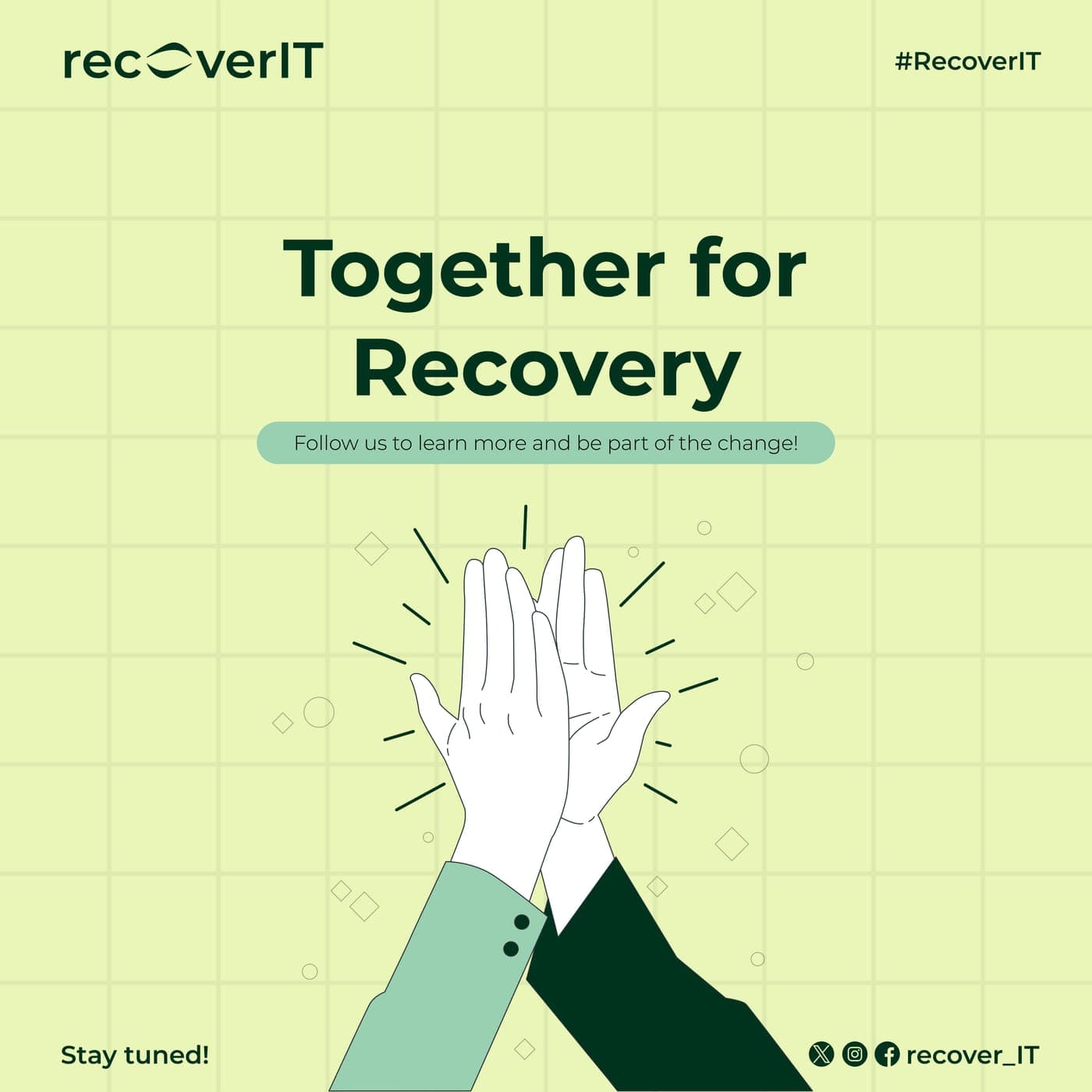
The identity rejects clinical visual language outright. Deep forest green and soft sage tones replace the sterile blues and whites of typical healthcare branding, paired with hero imagery of terraced hillsides, recovery framed as growth and renewal instead of treatment.
- 02
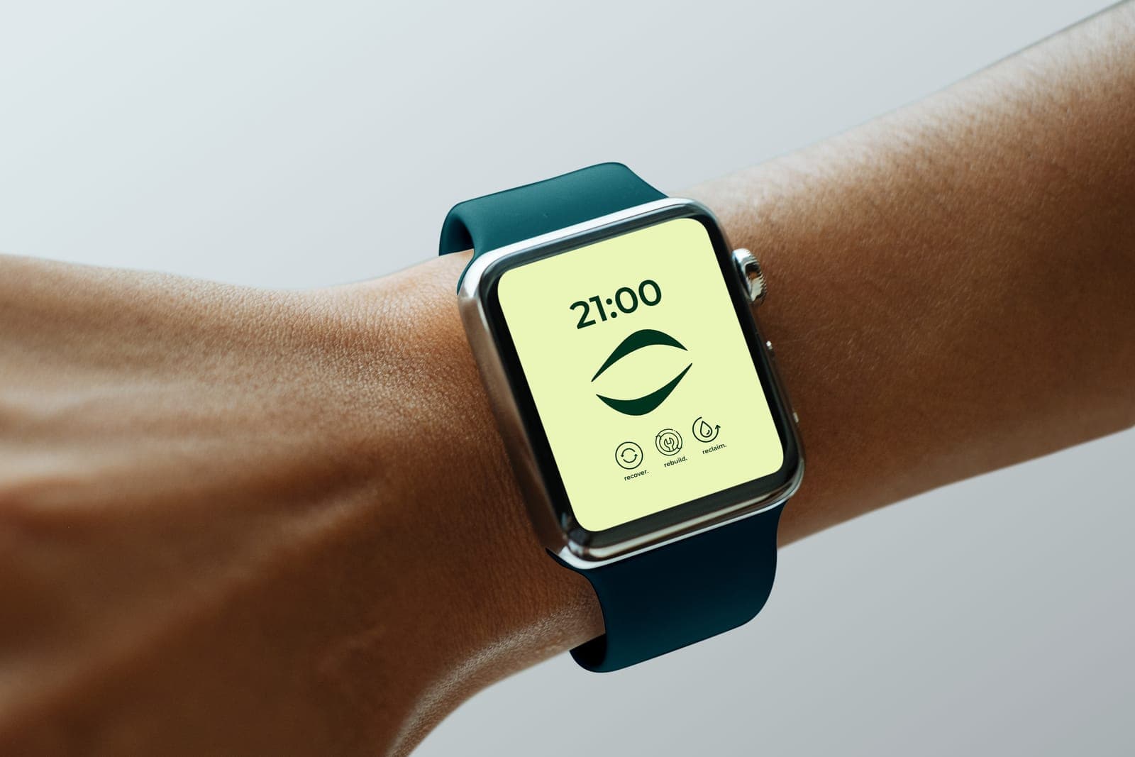
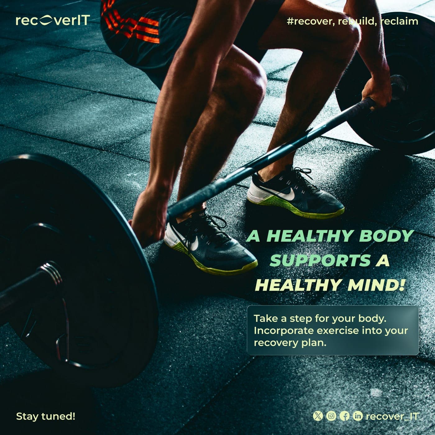
The three-word framework, recover, rebuild, reclaim, became the structural spine of the identity rather than a tagline bolted on afterward. Each word got its own icon, a refresh cycle, a growth mark, a water drop, and the three combine into the brand mark itself, so the logo literally represents the process it's naming.
03Outcome
Full brand identity concept built around AI-powered, stigma-free recovery support.